Job Creation Performance and Unemployment Rates for Wisconsin and Ohio

Everyone seems to be talking about state budgets and governors performance. I guess Menzie started things out with this post. Joe Wiesenthal followed up with this post. Although the job creation performance of Governor Walker in Wisconsin and Governor Kasich in Ohio are not resounding successes they are not complete failures either. In a recent post I found both states showed a dramatic improvement in business environment over the last two years according to ChiefExectutive.net. Unfortunately popularity with chief executives does necessarily translate into jobs. The optimism of chief executives is not echoed in the 2012 State Business Tax Climate Index report by Tax Foundation. Wisconsin is number 43 on the list and Ohio is number 39.

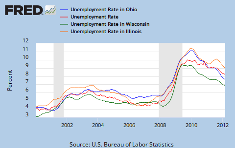
Since Menzie pursued the job creation angle, I decided to use Fredgraph to create an unemployment graph for Wisconsin, Ohio, Illinois, and the United States, http://research.stlouisfed.org/fredgraph.png?g=7eN. Looking at the graph I am not sure I would be complaining too much if I lived in Wisconsin. It could be worse. The job situation is much more precarious in Illinois. Although Menzie correctly points out that the job creation in in Wisconsin is pretty anemic, both Wisconsin and Ohio unemployment rates are below the national average. This is pretty good job performance considering how poorly they rank in business tax climate. Unfortunately most of the future job gains in Wisconsin and Ohio will probably come from job losses in other states such as Illinois. If Illinois’s unemployment rate remains above the average, their government financing remains a mess, and if either Wisconsin or Ohio can improve their business tax climate to a Illinois’s level, then Wisconsin and Ohio should be successful at poaching jobs from Illinois. This should be a major part of any jobs plan along with new jobs created by green industries and shale gas.

Was our last economic boom due to consumer debt?

When I read the post, A Deep Look At Revolving Credit, And What It Means For Consumer Spending, the graphs inspired me to try my hand at answering some questions I have been about the importance of consumer debt to our last economic expansion.  So the first thing I did was to create a graph using FRED of the revolving debt versus the S&P 500. To avoid issues with scaling and different units, I told FRED to scale the graph using the latest available data as 100. From the graph I could see that there was a strong relationship between the two lines but I had some other questions. How much of the increased debt was due to the increase in population and inflation? My solution was to create a per capita revolving credit estimate by dividing the revolving credit by the population of wage earners and scaling it to 100 and adding a separate line for the inflation index. Here is the final result.


fredgraph_percapita

Now this is an interesting graph. We can see that the S&P 500 and the per capita revolving credit have a close relationship up until the internet boom of 2000. Then things go haywire. We can also see that the per capita rate of revolving debt started to accelerate after 1983. It continued to increase at a rate greater than the inflation rate until 2007 when it started a decline despite a much larger number of wage earners and inflation. This leads me to conclude that the wage earner’s debt was maxed out in 2007.

The next question I had was where does the per capita revolving debt go from here? One way we can make an intelligent guess at the answer is to go from the premise that per capita revolving debt should have grown at the rate of inflation. Using a regressed line of the CPI to provide us with the slope of the line, we would expect that per capita revolving debt still needs to drop another 10% to reach the point that inflation rate would have predicted. Since the wage earner was probably maxed out in 2007 I think the wage earner is unlikely to add more debt any time soon. They are still close to their max debt load. If we assume that wage earner’s tolerance for debt and inflation rates does not change dramatically then it make take another year or two for the wage earner to pay down enough debt and establish enough distance from their max debt level. On the negative side if the wage earner gets panicky about the future of their job and the economy,  there might be some debt repayment overshoot. The logical conclusion is that this new normal for revolving debt will be bad news for the companies whose sales are dependent on revolving debt and make if very difficult for this economy to expand for the next two years.